So with all the organizing and cleaning out we do this time of year it can create a small dilemma for some of us. How can we display things without it looking cluttered? I was thinking about this very problem this weekend and decided to go on a hunt for some inspiration of rooms and places where that had been accomplished. Let’s check them out and see what we can learn.
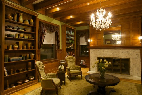
I love the way the pottery in this room is organized by color. Nothing cluttered here!
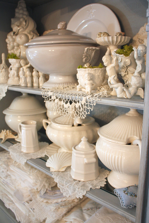
Another great example of grouping similar colors together. The all white look is so classy!
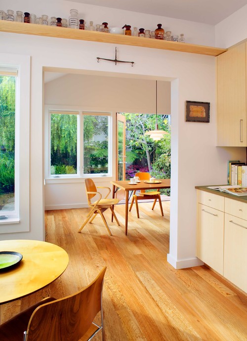
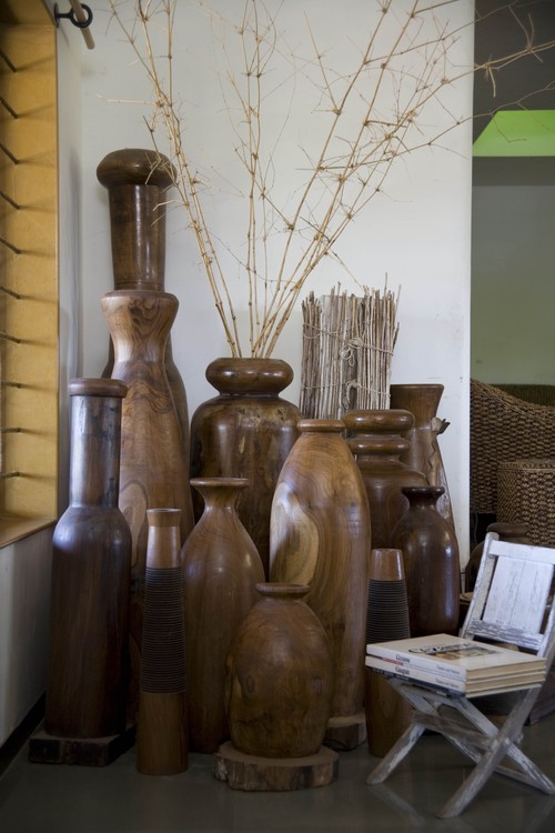
Sometimes collections look great when placed up high where they can be observed. I think the look of this bottle collection is so eclectic and organic – but it is not cluttered!
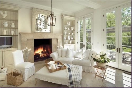
Another all white collection – I love this one. Isn’t this room just beautiful!
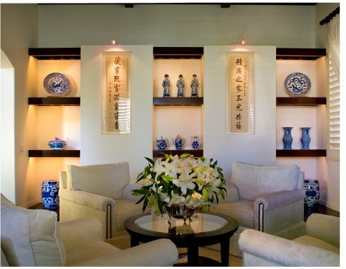
This is a great example of mixing two different types of collections. One is pottery the other is calligraphy – but they both have an similar feel which keeps the look cohesive.
Love this grouping of larger items too and how they are grouped according to size.
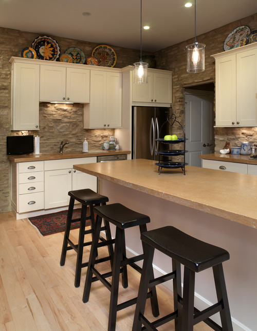
These plates on the ledge are another great example and a great way to use some of that wasted space above the cabinets.
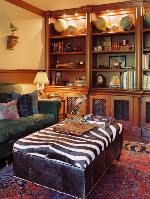
Finally – this last picture has so much. A great collection of globes, tins, books, and model planes and cars. All balanced and perfectly uncluttered. (Although I am not sure about the parrot over there to the left.)
So there you go – now what do you think? What are your tips on how to display collections? Or what are your fears on how collections can become cluttered? Let’s all share and see what we can learn!




13 frugal friends said ...
Nice post and grat inspiration. I love collections but displaying them is definitely an art.
Love those pics, You've seen the Buckeye room...overkill on a collection? I am kinda getting tired of looking at it, but I committed to the man, I am committed to the collection. Love what you've shown!
My husband collections petro/oil industry (his employer) stuff. In our office we have a cream colored office set as the background and he just has that unit to display his favorites. If he gets something new or wants to see something different then he has to swap with something already out!
It works. It looks pretty interesting yet not overwhelming or cluttered!
That first rooms green is my very favorite color so I HAVE to love the green collection, too!
I try not to collect too many things and yet, I do. I have a plate problem - lol. (Which is why I'm getting rid of a bunch on Etsy that I've acquired over the years.)
My husband and I are well suited in that we each have a few vintage toys we've collected over the years. Right now they are displayed on shelves in the living room along with family photos.
I definitely have a candle obsession - I have a drawer full. I found an adorable wooden box for $5 at IKEA to keep my pile of tea lights in and on display.
I have a collection of vintage wooden cheese boxes that I use for tv remotes and game controllers. (Love using them that way! It was a top from Donna at Funky Junk if I remember correctly!)
I love clocks. That one is difficult. Really difficult. Sure I've seen magazines with walls of clocks as a display, but that doesn't appeal to me. So, it's an issue - lol.
Anyway, thanks for the ideas!
Great suggestions!
I love those globes!
I'm actually thinking of buying a collection of old keys and working out a funky way of displaying them... I'll blog it if I do!
Like Dana I also love clocks - but I collect 'weird' clocks like a binary clock and one that runs backwards. I try to keep just one per room :)
Jess,
Thanks for sharing all these beautiful pics...love all that white ironstone.
Blessings,
Linda
Thanks for sharing these beautiful photos! I love the old bottle collection and all the whites.
Thank you for stopping by my blog and linking my project to your facebook page :)
hugs,
Amanda
all the white ones really hit me...I like the mono color - it just simplifies everything. Not that my house looks like that .....yet.....but a girl to dream!
Awesome! Now I just need to start collecting something that looks pretty. Right now I pretty much just collect wooden hippos.
Hi Jess!! I am not a collector of anything... but if I group something then I consider height, spacing or no space, symmetry, and it's good to display in a triangle format if you have different heights to deal with... things I learned in the retail display world! Congrats on baby!! :)
I really like the white ceramic with the doilies. The all white always appeals to me but I can' ever seem to make collections look as pretty as these. Thank you for sharing.
"Displaying Collections Without Being Overwhelming" offers valuable insights. Security Of Wordpress Plugins How To Choose Safe Ones Strategic placement and curation maintain aesthetic harmony. It celebrates individual pieces, creating focal points.
Post a Comment
Your comments mean the world to me - so please leave one! It makes my day! I read and try to respond to each one!
Didn't get a response? Check out my tips here to link your email and blog back to your profile.