Well - we are pretty much in and unpacked by now. The only area to finish up is the guest room/my craft room. And to figure out where to put all my decorative accents - but we will deal with that later. In the mean time, now that we are in and I have the "space" set up with furniture I am trying to decide what to do with each area. I am starting off with the Dining Area - see a picture below.
I really do like the paint color and since it is one big "great room" that connects the kitchen, living room and dining room I am going to leave that be. The dinette set was one of the "free" furniture pieces that we got from a friend. I know I want to do some sort of large art on the wall back there, perhaps add a rug, get some cute table accents, and of course recover those seat cushions. Here is a close up of the chair and the cushion.
I am also not sure if I love this mottled gray finish, I think you need to click on the picture to see it. It is kinda that hammered silver black faux finish thing. Potentially - this whole thing will get spray painted jet black.
Here are some of my inspirational pics that I am going to try to steal some ideas from as I transform the space!
So don't you just love this - it is so classy and elegant. I think I will need a nice sized centerpiece like this one on the round table.
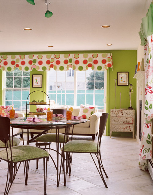
I really like how the chairs pop here! I am thinking about doing a brighter color or pattern on the chairs rather than the ho-hum beige that is on them now.
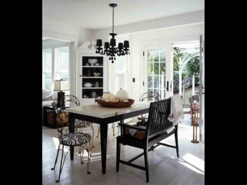
On the other hand - I love the black and white prints here. I think I REALLY want to do a Black and White kitchen (to go with my Bird Prints!) and I think a Black and White Dinette to match would be cute!
Photo via House Beautiful
Photo via House Beautiful
Photo via House Beautiful
On the other hand - I love the black and white prints here. I think I REALLY want to do a Black and White kitchen (to go with my Bird Prints!) and I think a Black and White Dinette to match would be cute!
But then again - that cute pop of color is intriguing! I love how playful and fun this space is!
But then there is that Black and White look that is so cute! I think this print is adorable!
I am torn! What do you think - pop of color or black and white?
But then there is that Black and White look that is so cute! I think this print is adorable!
I am torn! What do you think - pop of color or black and white?

Linking this up with the Inspired by Party with Melissa @ The Inspired Room


9 frugal friends said ...
Pop of color! Pop of color! I linked up to the Inspired By party also.... with a post on green! Check it out! I love color!
Color!! You are young! Plenty of time for black and white later.
Dropping by from The Inspired Room. Come see what has inspired me in Blog Land. Don't forget our giveaway ends Saturday night - be sure to register for it at AtticMag!
Allison
Congrats on the move. Enjoy making the space your own. I think that a pop of colour would go best with these chairs. Cute chairs... :)
I also vote for a pop of color!
I'm with the majority! COLOR...especially on those iron chairs. They would look AMAZING if you painted them white and then rubbed off a lot of the paint so the black came through and looked heavily distressed...and then a colorful cushion. I think that would look amazing and it would look great in contrast to the dark wood top.
Color on the chairs. A nice, modern print, maybe, with some great color would really liven them up and make them contemporary.
Congratulations!!!!!!! Saw you were the big winner, you have to be super excited.
I love all of them! But after looking through your blog and seeing your darling Spring Welcoming Sign that you made... I definitely think you should go with the POP of COLOR!
Thanks for stopping by my blog on Wednesday for my SITS Featured Blogger day. It was a crazy, fun day with all of you SITS girls!
B&W WITH a pop of color :)
Post a Comment
Your comments mean the world to me - so please leave one! It makes my day! I read and try to respond to each one!
Didn't get a response? Check out my tips here to link your email and blog back to your profile.