So on my to-do list is a gallery wall for the hallway. And like a lot of things on the list, it has been on there for at least 3 months. So I was super excited when Melissa @ The Inspired Room announced she was having a link party next week on gallery walls. Sometimes it just takes a deadline to get me going. So I will be ready next week!
So I got to looking for ideas and came up with a question. What do you prefer in gallery wall – do you prefer them symmetrical or asymmetrical? I thought I would share a couple examples of each and let you guys debate amongst yourselves what you prefer! So here we go!
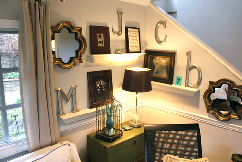
This little corner really works with an asymmetrical arrangement don't you think?
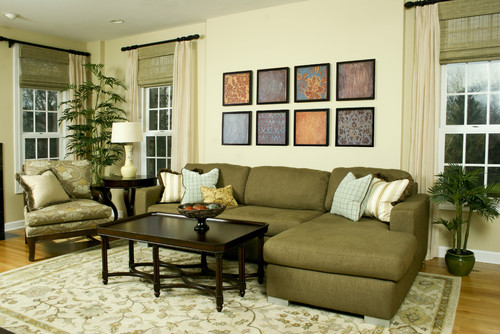
So this room feels a little staged – but the organized side of me enjoys the different patterns lined up precisely behind the couch!
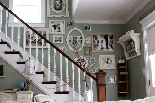
This random layout is both cute and quirky at the same time!
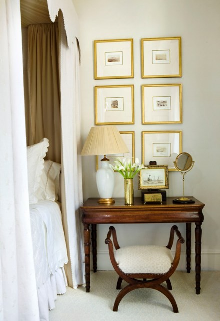
But this neat grouping in the bedroom makes me feel organized and at ease.
A traditional living room with an asymmetrical arrangement can be inspiring as this Restoration Hardware room shows.
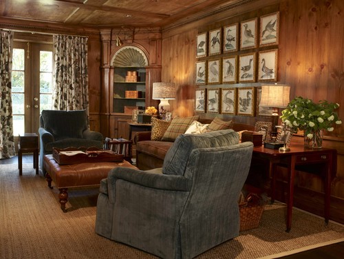
Or you could go all out symmetrical and still keep it traditional like these wood cuttings.
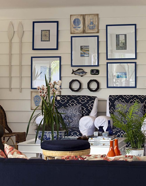
This somewhat random nautical layout does seem beachy and laid back!
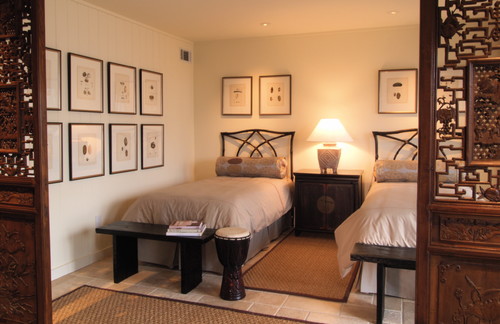
But then again – keeping it neat and linear like in this bedroom is also calming don’t you think?
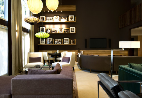
Or maybe you want to split the difference? The shelves in this room are very symmetrical but all the photos are different sizes which still gives it a little bit of an abstract feel.
So there you go – where do you land? Symmetrical, asymmetrical or a little of both! I wanna know! As for me? Well you guys will just have to wait for next week to see where I decide to take my stance! And don’t forget to head over to Melissa’s next week for the gallery wall party! I will see you there!





16 frugal friends said ...
I am crazy about gallery walls and so excited to see yours! I'm not a very organized or neat person so I really love gallery walls that are asymmetrical :o)
I think the super symmetrical look feels a bit like a hotel or vacation home. It's like you're too scared to take a risk. On the other hand, i agree that it's calming... I just don't think it needs to be 3x3 of the same size/shape/frame to be calming.
Of these my favorite is the symmetrical shelves with the randomized frames. That effect doesn't need shelves to work- you can also just line up the center of your frames to give it weight and organization while still having that asymmetrical personality-
like this -
http://www.thenester.com/wp-content/uploads/2011/02/behind-the-sofa_gallery-wall.jpg
OR- the converse idea- make the spacing uniform while the color is wildy different. like this-
http://t3.gstatic.com/images?q=tbn:ANd9GcTOYdW68CD_LcrTYsCZwiW6fkpGXlmSUmUyf3S6gpARVUKCqQFsgw
Whatever you do, I'm sure it will be great! All your projects are!
I like them both, it just depends on the mood of the room!
I REALLY want a gallery wall! We actually just took new family pictures for that exact purpose...but I have the same questions...I don't thing I have the eye for random even though I want it!
ANY IDEAS of what color paint is in that picture from chicago w/ the quirky layout. I love that color on the walls as much as I love the layout.
debraclaytor@yahoo.com
I like a combination of both. To mee, the symmetrical ones are a bit stiff, while the asymmetrical versions a messy. I think a version which combined the order of the first, but the whimsy of the latter would be perfect.
Picture #3 is definitely my favorite. I love the structured chaos. Plus, anyone with grey walls is okay in my book. If frames are too perfect, too lined, up I feel like the room has been staged for a realtor's open house.
I like them all, but I think I'll always go for the asymmetrical. I think I was born without the gene that enables people to tell if something is level. Getting all my lines as even as these pictures would be a herculean effort for me!
Funny, I would have said symmetrical, but the ones that drew me in were asymmetrical. I especially like photos 1, 3, and 7. I especially like the mix of three dimensional objects and photos. Have fun!
I am defintiely an asymmetrical person. It is much more pleasing to my eyes... Unless those symmetrical frames were glued to the wall or nailed in all four corners, it would drive me to distraction if they were not all perfectly straight! And with five kids in the house, how long would that last? :o)
I would have thought that I would have said symmetrical, I like symmetry, or so I thought...I love all of the asymmetrical, they seem more personal too. Great examples!
I love both- it just depends on the room. If I wanted it to look more casual I'd do asymmetrical, but if I was going for a more formal look I'd do symmetrical. Both ways are beautiful!
Well, I''m kinda hoping you went for symetrical or the shelves - since for the 2 symetrical pics you said were "organized and at ease" and "calming."
As for me, well, I can do asymetrical but they have to have a strong cohesive element. Years ago (think the days of early 90's brass) I had a wall of family photos that were in different kinds of gold frames.
Right now most of my family photos are in rustic weathered frames. I'm thinking about putting them asymetrically around a giant clock I have on one wall. I think the "rustic" feel is enough to marry them. (Too much "free-forall) would be disconcerting to me.)
Can't wait to see what you did!
I popped over to look at some of your older posts, and I remembered a post (on another blog) that was themed right in here with this one -but it took me 2 days to remember who the blogger is! Suffice it to say -thanks for the inspiration, and if you want to see another awesome gallery wall, head over to {twenty}something. Hope you are doing well, happy 2012! Link: http://twentysomethingtransue.blogspot.com/2011/07/gallery-wall.html
I do love a salon-style display - that's the interior stylist's technical term for a gallery wall of artwork of various sizes, colours and types.
bape
golden goose outlet
kyrie shoes
jordans
kd shoes
golden goose
golden goose
off white nike
golden goose outlet
adidas yeezy
Post a Comment
Your comments mean the world to me - so please leave one! It makes my day! I read and try to respond to each one!
Didn't get a response? Check out my tips here to link your email and blog back to your profile.