There seems to be a divide out there in the design world. In one camp, those who would insist that the TV Wall should remain blank to not draw attention away from the screen. There is another camp that seems fine with putting all kinds of stuff around it. Today, I would like to present arguments for either side and find out where you stand on the issues!
I like the idea of abstract placement of these clocks around the edges of the television - almost framing it.
However, the feature on this wall is the TV. The rest of the decorative details and the color is left to the other parts of the room.
On the other hand, this collection of numbered prints is both whimsical and playful and feels less stark.
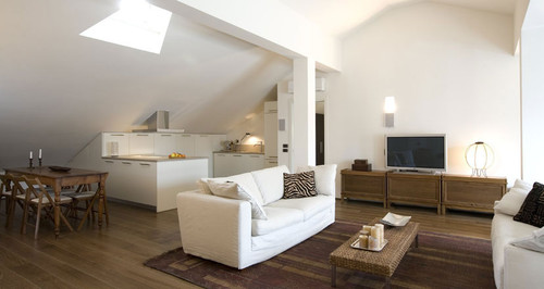
Counterpoint goes to soaring white walls and warm contemporary furnishings.
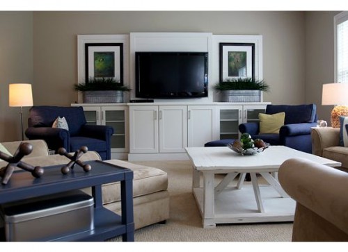
But the symmetry in these details is also calming. Especially with the blue green prints and soft greenery.
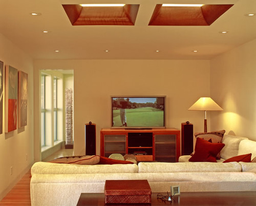
But do you really want a bunch of stuff distracting you when you watch golf? (I know my answer is yes -pluueeaaasse!)
But maybe you don't need a lot of stuff? Just a shelf with some small details?
Or should the details be focused where the conversation is instead of where the TV is?
At the same time, should you really forsake great vertical space that could be valuable storage? I can't ever find it in my heart to argue against storage!
I like the idea of abstract placement of these clocks around the edges of the television - almost framing it.
Image via Pottery Barn
However, the feature on this wall is the TV. The rest of the decorative details and the color is left to the other parts of the room.
On the other hand, this collection of numbered prints is both whimsical and playful and feels less stark.
Image via Pottery Barn
Counterpoint goes to soaring white walls and warm contemporary furnishings.
But the symmetry in these details is also calming. Especially with the blue green prints and soft greenery.
But do you really want a bunch of stuff distracting you when you watch golf? (I know my answer is yes -pluueeaaasse!)
But maybe you don't need a lot of stuff? Just a shelf with some small details?
Or should the details be focused where the conversation is instead of where the TV is?
At the same time, should you really forsake great vertical space that could be valuable storage? I can't ever find it in my heart to argue against storage!
So many questions, yet the divide is so great! What camp are you in - keep it blank or show it some love and add some details? Do any of the pictures just "call" to you? I think I am in the middle - but leaning towards doing something besides just a TV! Now I just have to come up with what!

Linking this up to The Inspired By party with Melissa @ The Inspired Room. Hop over and get some more inspiration!





15 frugal friends said ...
I like the pics that have a little design around the screen. It doesn't seem like it's floating all by itself. Hugs, Marty
The real question is what do you want the focal point to be? Are you a "TV Family?" Is the TV the center and focus of your living room? Is it on ALL the time?
Let's be honest- who really gets distracted by things around the TV? Unless it's a plant frond waving annoyingly in front of the picture, it's not truly a distraction. We Americans know how to get really sucked in.
I'd say this- if you think the turned-off TV looks good, if it's sleek and modern and you have a techy style, then it's its own decor and shouldn't have anything around it. If the turned-off TV creates a vacuum in your decor, and you feel like it looks "unfinished" then decorate around it.
Decorating rules are more just guidelines anyway. :)
Great question! I was just pondering this today as I looked at photos of a designer's room where she had hung all sorts of things around her TV. It looked a little busy to me, frankly. We put bookshelves on either side of our flat screen so I wouldn't have to deal with the walls around it.
I agree with Vianki. It would take quite a bit for me to get distracted when I'm watching my favorite shows. I think it all depends on scale and proporation. If the TV is the appropriate size for the wall it can definitely stand alone. Sometimes a TV on a big wall can seem like a giant black hole so I think to soften it a bit and add something around it. I was drawn to the first picture with the clocks. It didn't overpower the TV or try to hide it but it did add to the vinette as whole.
We're having a discuccion over on our blog about how design can be like therapy and I would love to see what your thoughts are.
www.atmosphereid.wordpress.com
I want something to hide my TV. I don't want a glaring black box to be the focal point of my living room. My home is small and last year we underwent a major renovation to make the living room/dining room/kitchen open to each other. I would like to find something similar to the Pottery Barn photo, but that cabinet isn't quite doing it for me yet.
p.s. I jumped over from The Inspired Room
I think some of the pics have too much around the tv, and it would distract me, but that's me personally. On the other hand some of the pics need something around the tv. I think it is personal preference. My set up(with tv and stand looks extremely similar to yours), however, we have 4 frames above the tv on the wall. It is not distracting but if the wall were to be left empty, it would have looked weird in our room. I guess it's up to you and what is pleasing to your eye:)
Hmm tough decision i guess it all depends on your taste buds!
I personally want a bit of decor around the tv some shelves, colourful vases, pictures nothing too distracting.
Great post though
You know what? They both work for me. I think a person can go either way. Myself, I like a little something around the tv.
I really liked the idea of the third photo with the TV behind doors--but that's just me. Our TV is literally whisked out of site when we aren't using it for DVDs. We don't want it to be the focus of our home. Vianki had some good points. There is no wrong answer. I'm sure you'll let us know what you decide, right? :-)
I really like the first one, with the clocks. And after looking through the pics I find I like some decor around the clock. I don't watch tv very often so the idea of decorating around it appeals to me-making it seem a bit less of a focal point, imo.
I like the idea of having a few small details or accessories, but not going overboard. Neat photos! Thanks for the visit today! :)
I am solidly on the "fill it up" side! Of course, that is my decor MO. Not so much to have lots of stuff- but for areas to feel full--of color, pattern, functional things. So paintings? Would be great. Shelves, art prints, vases, photos, chatchas, wall graphics, am awesome wall paper--anything but the great blank expanses of white!
I guess I'm a little late on the topic, but all of these rooms look great. I guess it just depends on if your room is modern and sleek, or a bit on the shabby chic side..or geared towards a serious "family" room. Great selection of pictures, I really appreciated the diversity. Thanks for posting.
Shadow Creation is the process to change the color of an image or video..Shadow Creation It means correcting the lighting, white color balance, red or blue color balance, so that the image looks more clear or natural
We couldn't have gotten into our nightly routine without the eeBoo Centering Cards—Bedtime. What a kind way to help youngsters wind down and get ready for bed with these cards. After a hard day, my kids can relax and refocus with their enjoyable and easy activities like visualizations and breathing exercises. They are great kids Educational Toys because they help children learn to control their emotions, which is a crucial life skill. You won't find a more practical or imaginative method to put your little one to sleep than with these cards.
Post a Comment
Your comments mean the world to me - so please leave one! It makes my day! I read and try to respond to each one!
Didn't get a response? Check out my tips here to link your email and blog back to your profile.