If there is one thing that I struggle with, it is the art of arranging seemingly random pieces on a table so that they look purposeful but not staged. I struggle because I tend to not purchase those kinds of accessories. If you can hang it on a wall - I am all over it. Even a dining room tablescape is no big deal, you have a "dining set" to start with as a base. But to pick items for a console or bedside table - I simply panic in the store. I can't commit to things because "I'm just not sure where I will put that." My fear of being junky and cluttered or deciding I won't like it when I get home causes me to admire but then ultimately walk away. People - it is true, I am a vignette-a-phobic. I have one in my house and I am so freaking proud of it. But that is as far as I have gotten.
So as a task for myself, I wanted to spend some time purposefully studying some rooms I love to try to see if I can pinpoint ideas and things I like and move forward from there. The goal: purposeful accents I love without being cluttered. Let's see if we can come up with some ideas!
Ok - so this one is fairly simple. We have a lamp, some flowers, a small knicknack and a book. I like how the items all have different heights.
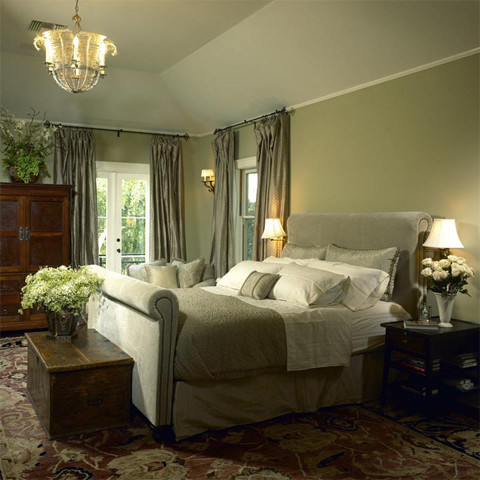
Ok - so this one is fairly simple. We have a lamp, some flowers, a small knicknack and a book. I like how the items all have different heights.

First, can I just say that I love this room. The moulding and the the mirror above the fireplace are perfect with those big windows and classic lines of the furniture. But there are several vingette's here. The lamp, picture frame, plant combo is a good one. Then you also have the smaller details on the mantle and a few choice items on the coffee table.
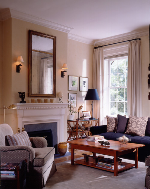

Ok, so here is a vignette that uses metallic or crystal accents. Hmm, I did just see a julep cup like that at Goodwill the other weekend. Perhaps that will have to go on my hunting list.
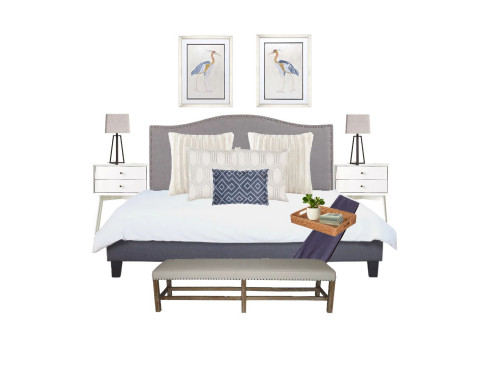

Love this room, but let's focus on the vignettes. Note the theme on each table. Flowers, picture frame, and some chotsky. With a larger item underneath on the base. Simple and yet effective.
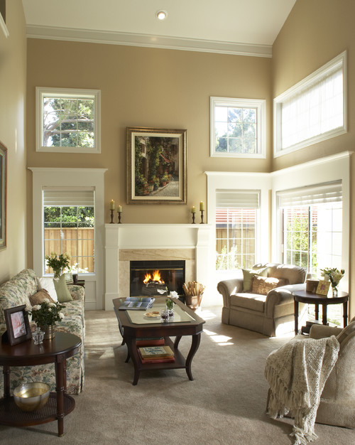

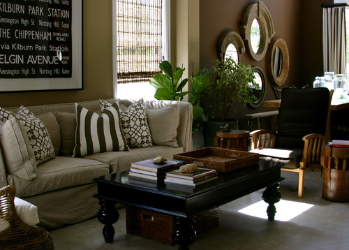
Ok - lets try not to get distracted by the fantastic colors and pillows here. We are focused on the tablescapes. Here - I am digging those two piles of books with the small shell/rock on top. Easy and beautiful. Now we can all collectively swoon over those mirrors back there. (Sigh!)

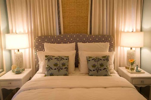
Very simple yet touching accents here. They look both personal and hand picked. I think I might have tried to add one more level of height in, but otherwise I like it.
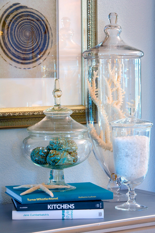
Ok I really like this one. Two groups of three (jars and books) and then a single starfish accent. Hmm, I know I like jars - perhaps I will start a jar collection.

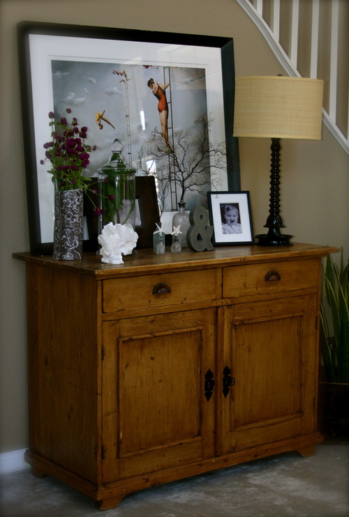
Ack! So this final shot was a little overwhelming for me at first, but I really like it. I think I would lose like three or four items and it would be perfect. Love the leaning picture as part of the set.
So what about you? Do you have commitment phobia when it comes to buying things for vignettes and accents? Or do you have the opposite problem and have so many you don't know where to put them? Do you have tips on how to keep things looking overly cluttered? I wanna know!




12 frugal friends said ...
Thanks for sharing these images - I too struggle with vignettes and arranging things I love in an UNCLUTTERED way. It's definitely a skill. Do stacks of folded laundry count as vignettes? Thats whats on my foyer table at the moment.
Love this post! I am in the process of trying to update the look of my house with simple touches such as those shown in these pictures. Love the ideas!
I think I have too many things. I like trays, books, jars, candles, plants and flowers. On side tables I try to keep things to 3 or 5, with things being stacked on books or in a tray or basket. You really need to look at all the tables that people show on my Table Top Tuesday party. There are some really creative people out there and they always show some of the most wonderful tables. You will find tons of inspiration. Hugs, Marty
lol, really love that post. too funny. this is definitely something that i struggle with. like, is it now too cluttered, etc? gah! do you read bower power? she did a whole post about console tables and vignettes talking about short and tall, and threes. you should check it out if you haven't already.
These pictures are great! I used to arrange and then rearrange and rearrange things some more, and it would drive me crazy. It would drive my husband crazy too. Finally, I said that is it!!! I don't need items to clutter my life, so I understand you walking away from a potential purchase. I now only pick up the things that I truly love and do it next to never. Too, I really don't want to dust anymore than I have to.
Right now if there is an empty space in my house my children and husband thinks that is just an opportunity to put a juicebox, random shoe, book, hair elastic, etc. You get the picture! I do love the leaning picture!
Very clever
I LOVE vignettes.....perhaps it would help you to think in triangles...notice in some of those pictures, especially the simple ones with three items.....they all form a triangle...a high item, a medium height and a shorter one...add in color, texture, and you might be pleased with what you come up. I'm with you on the last one...too much to dust, and the eye doesn't rest anywhere...some blank space is good to let your eye rest! And it's easier to dust!! :D
Suzanne
LOVE your blog! I'll be back!
Just read this and thought I'd share it with you about tabletops...hearing it from one of the best may inspire you!
http://www.nellhillsblog.com/?p=646#more-646
Suzanne
Sometimes getting the right look... takes time.
I have to admit, this is one thing I like to do. I rotate my items with the seasons, and sometimes just because! I absolutely love the photos! I wish my home always looked like that!
I totally, totally don't do this. Not that I don't LOVE the images you've picked out - each and every one of them is gorgeous - but I just couldn't cope with having extra stuff to dust. No matter how pretty.
I always loved the Christopher Lowell show because he addressed this issue so often. He always advised that the key was to layer your look and to use "lifts and levels" in your arrangements. If the height of two objects were too similar, he'd use something to give on of the items height, books, for instance.
Post a Comment
Your comments mean the world to me - so please leave one! It makes my day! I read and try to respond to each one!
Didn't get a response? Check out my tips here to link your email and blog back to your profile.