
So awhile back I asked you guys what you preferred... art centered over the couch or centered on the wall. I showed some examples of each and the conclusion that I came to was that personally, I like it to be centered behind the couch. And most of you agreed with me on that!
So to refresh - here is a shot of what our living room looked like before. Note that it is still in need of both art behind the couch and a fix for those ugly vertical blinds.

So here is what I added! Check it out!

Love it!! So I had this painting in our "other house" and had been using it as a staging piece in our living room. So I thought it would be perfect on this wall and sure enough it was!! I just love how it looks!

I also switched out my blue pillows for some fall colored ones. The brown ones have a sage green stitched leaf patter and then the lighter chenille ones are so cozy for fall! I think it all picks up the colors in the painting as well.
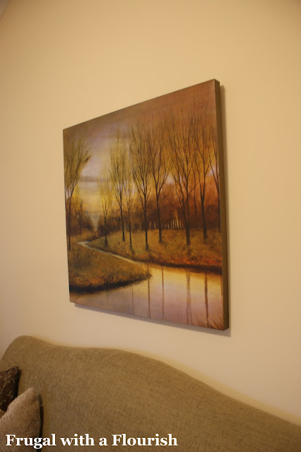
The painting itself is very fallish - but I just love the colors in it. I originally got it on clearance at Bed Bath and Beyond. Just $45! Such a steal for a piece that big!

Sigh ... I love it! And I am so glad to have it back! I really think it just makes the room! Now all that's left is those blinds (which I have a plan for ... I just need to execute it) and figuring out some baskets for the table.
So - let's hear it. Now that it is up in the room - do you like it where it is behind the couch or do you think it should have been centered on the wall? Let's see where you all end up this time!
P.S. And it really is centered behind the couch, but since none of these pictures are dead on it looks a little off! I actually stood up and checked it once I started editing the photos!!
So to refresh - here is a shot of what our living room looked like before. Note that it is still in need of both art behind the couch and a fix for those ugly vertical blinds.
So here is what I added! Check it out!

Love it!! So I had this painting in our "other house" and had been using it as a staging piece in our living room. So I thought it would be perfect on this wall and sure enough it was!! I just love how it looks!


Sigh ... I love it! And I am so glad to have it back! I really think it just makes the room! Now all that's left is those blinds (which I have a plan for ... I just need to execute it) and figuring out some baskets for the table.
So - let's hear it. Now that it is up in the room - do you like it where it is behind the couch or do you think it should have been centered on the wall? Let's see where you all end up this time!
P.S. And it really is centered behind the couch, but since none of these pictures are dead on it looks a little off! I actually stood up and checked it once I started editing the photos!!

Linking this to
Metamorphosis Monday with Susan @ Between Naps on the Porch
Anything Related with Bridgette and Rebekah @ All Thingz Related
Get Your Craft On with Kim @ Today's Creative Blog
Make it Yours Day with Carolyn @ My Backyard Eden
Anything Related with Bridgette and Rebekah @ All Thingz Related
Get Your Craft On with Kim @ Today's Creative Blog
Make it Yours Day with Carolyn @ My Backyard Eden


23 frugal friends said ...
I like it where it is! I'm a centered behind the couch person for sure!!
Definitely centered over the couch, looks great!
...love the pic w/ the kitty!
oh yes, if it wasn't there, the whole thing would look wonky.
so did you ride your bike to the library or what? that sounds like a great gift! good luck on the giveaway!
I prefer it centered over the couch. Wonky is the word I'd use, too, if it were centered on the wall. If I may, I think the venitian blinds need a fabric valance or scarf to soften it a bit.
I so much like the blog. And I would to say How the nice furniture. I can't believe it. Really nice. :)
I'm a center of the wall kind of gal. I rearrange the furniture so often that the center of the couch is not a fixed location!
So pretty! The colors in your print are perfect in your room! *Becca*
I'm a bit ADD and a bit OCD and I know if it wasn't centered with the couch, I'd be wanting to move the couch all the time! lol
I like the centered above the piece of furniture look best. I have an image of a room from Suzanne Kasler where she centered a group of pictures above a sofa and then balanced it with a group of three pictures hung horizontally at the end of the wall. That's a good solution for someone with a long wall.
Cute. Thanks for the inspiration. We just moved and I am all about decor these days. I am a new follower. Stop by my crafty blog when you get a chance! Blessings...
Saved By Love Creations
I think it looks great. Since you have lots of wall space above and on the sides, your wall could easily accomodate a grouping, I think I'd add an iron scroll work piece to the top and maybe something on the sides.
It looks great - centered with the couch!
Love the room
Looks fantastic!
Dee Dee
I think it looks great centered above your couch! What a difference it makes to the room, too! I love the pillows you added as well. (And I must say, I am loving that gorgeous coffee table you have in front of the couch!:)
I hope you are having a good week!
Blessings,
Jenni
{Beautiful Nest}
Love your painting very much, it suits the overall mood of your room very much. The room sounds comfy, and inviting, without a overloaded hustle bustle of decor, a neat clean lined room, Coffee table is something I love...Cushion enhance the beauty of your sofas, overall a very inspiring room.
Wish you happy time here,
love
I think it looks fine because the lamp in the corner fills in that extra space on that side.
I've admired that painting on Overstock. Looks terrific! It seems "centered" to me because of the corner lamp and light switch flanking the sofa. Very soothing look. TFS.
I love the natural tones in the room, the picture brings it all together.
I vote for behind the couch! It looks great in the room! Love it.
Perfect, just as it is. If you hadn't mentioned it, I wouldn't have noticed it wasn't centered!
oooh, I can't wait til I get a place and get to unpack all my stuff! Almost makes the delay worth it. . . almost!
I like it where it is. It's a very pretty room!
Hi Jess, Yes, centered is best. Sometimes I'll put something on the wall to make the art look more centered, i.e., a large tree in the left corner. (I know you don't have the room there, just musing.) The art is very pretty in the room.
Very modern and relaxing atmosphere. I am having the same problem so this has helped me a lot!
Post a Comment
Your comments mean the world to me - so please leave one! It makes my day! I read and try to respond to each one!
Didn't get a response? Check out my tips here to link your email and blog back to your profile.